CSS布局
Silas Shen
10月 30, 2017
基于浮动的布局
浮动与清除
- 文本绕排图片
 p {margin 0;border:1px soild red;}
 img {float:left;margin:0 4px 4px 0;}
- 创建分栏
 p {float:left;width:200px;margin 0;border:1px soild red;}
 img {float:left;margin:0 4px 4px 0;}
围住浮动元素的方法
- 为父元素添加overflow:hidden
section {border:1px solid blue;margin:0 0 10px 0; overflow:hidden;}
img {float:left;}
p {border:1px solid red;}
- 同时浮动父元素
section {border:1px solid blue;float:left;width:100%;}
img {float:left;}
footer {border:1px solid red;clear: left;}
- 添加非浮动的清除元素
.clearfix::after {
  content:".";
  display:block;
  height:0;
  visibility:hidden;
  clear:both;
}
中栏流动布局的实现方法
- 用负外边距实现
<div id="parent">
  <div id="center"></div>
  <div id="left"></div>
  <div id="right"></div>
</div>
<style>
  #left {
    float: left;
    width: 150px;
    /* 调整left位置,值等于自身宽度 */
    margin-left: -100%;
  }
  #center {
    float: left;
    width: 100%;
  }
  #right {
    float: left;
    width: 210px;
    /* 使right到指定位置,值等于自身宽度 */
    margin-left: -210px;
  }
</style>
- 用css3单元格实现
<div id="parent">
  <div id="left"></div>
  <div id="center"></div>
  <div id="right"></div>
</div>
<style>
#left {
  display: table-cell;
  width: 150px;
  background: #dcd9c0;
  padding: 10px;
}
#center {
	display: table-cell;
	background: #ffed53;
	padding: 10px 20px;
}
#right {
	display: table-cell;
	width: 210px;
	background: #3f7ccf;
	padding: 10px;
}
</style>
- 使用flex
<div id="parent">
  <div id="left"></div>
  <div id="center"></div>
  <div id="right"></div>
</div>
<style>
#parent {
  display: flex;
}
#left {
  width: 150px;
}
/* 均分#parent剩余的部分 */
#center {
  flex: 1;
}
#right {
  width: 210px;
}
</style>
- 使用grid
<div id="parent">
  <div id="left"></div>
  <div id="center"></div>
  <div id="right"></div>
</div>
<style>
#parent {
  display: grid;
  grid-template-column: auto 1fr auto;
}
#left {
  grid-column: 1 / 2;
}
#center {
  grid-column: 2 / 3;
}
#right {
  grid-column: 3 / 4;
}
</style>
Flexbox布局
概念
采用 Flex 布局的元素,称为 Flex 容器(flex container),简称"容器"。它的所有子元素自动成为容器成员,称为 Flex 项目(flex item),简称"项目"。
容器默认存在两根轴:水平的主轴(main axis)和垂直的交叉轴(cross axis)。主轴的开始位置(与边框的交叉点)叫做main start,结束位置叫做main end;交叉轴的开始位置叫做cross start,结束位置叫做cross end。项目默认沿主轴排列。单个项目占据的主轴空间叫做main size,占据的交叉轴空间叫做cross size。
容器属性
- flex-direction
.box {
  flex-direction: row | row-reverse | column | column-reverse;
}
- flex-wrap
.box {
  flex-wrap: nowrap | wrap | wrap-reverse;
}
- flex-flow
.box {
  flex-flow: <flex-direction> || <flex-wrap>;
}
- justify-content
.box {
  justify-content: flex-start | flex-end | center | space-between | space-around;
}
- align-items
.box {
  align-items: flex-start | flex-end | center | baseline | stretch;
}
- align-content
.box {
  align-content: flex-start | flex-end | center | space-between | space-around | stretch;
}
项目属性
- order
- flex-grow
- flex-shrink
- flex-basis
- flex
- align-self
骰子布局demo
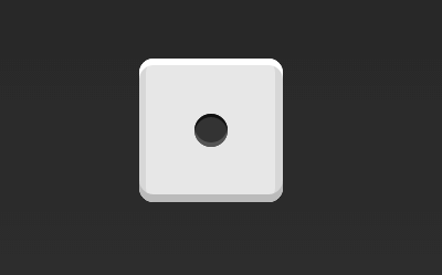
.first-face {
  display: flex;
  justify-content: center;
  align-items: center;
}
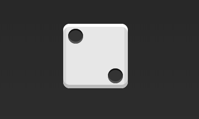
.second-face {
  display: flex;
  justify-content: space-between;
}
.item:nth-child(2) {
  align-self: flex-end;
}
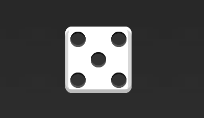
.fifth-face {
  display: flex;
  justify-content: space-between;
}
.fifth-face .item {
  display: flex;
  flex-direction: column;
  justify-content: space-between;
}
.fifth-face .item:nth-child(2) {
  justify-content: center;
}
Grid布局
其他常用布局方式
百分比布局
.Grid {
  display: flex;
}

.Grid-cell {
  flex: 1;
}

.Grid-cell.u-full {
  flex: 0 0 100%;
}

.Grid-cell.u-1of2 {
  flex: 0 0 50%;
}

.Grid-cell.u-1of3 {
  flex: 0 0 33.3333%;
}

.Grid-cell.u-1of4 {
  flex: 0 0 25%;
}
双飞翼布局
<div class="container">
  <div class="center"></div>
  <div class="left"></div>
  <div class="right"></div>
</div>
<style>
/* 见中栏布局的第一种方法 */
</style>
圣杯布局
方式2
<div class="HolyGrail">
  <div class="center"></div>
  <div class="left"></div>
  <div class="right"></div>
</div>
.HolyGrail {
  display: flex;
  flex: 1;
  min-height: 100vh;
}

.center {
  flex: 1;
  background: red;
}

.left, .right {
  /* 两个边栏的宽度设为12em */
  flex: 0 0 12em;
  background: yellow;
}

.left {
  /* 导航放到最左边 */
  order: -1;
}
@media (max-width: 768px) {
.HolyGrail {
  flex-direction: column;  /* 如果是小屏幕,三栏会变为垂直叠加 */
  flex: 1;
}
.center,
.left,
.right {
    flex: auto;
  }
}